wow. some pretty amazing posters about israel's attacks on gaza over on free pixels.
it's really sad that the energy of designers needs to be used to protest the free-wheeling violence of the powerful, but it must be met with some response.
[ detail of a poster by carlos latuff ]
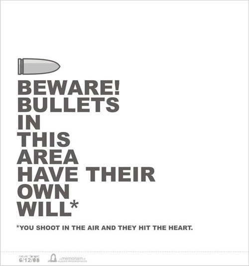
greek protest posters
a tidbit over at social design notes about the greek protests sparked by the police murder of 15 year old alex grigoropoulos. there was quite a large visual response that accompanied a huge amount of protesting in the streets.
check out a collection of some posters here, and some interesting commentary about them here.
a good interview with alex's friend, who was with him when he was shot, is located here. tragically, it sounds no different from any other act of police brutality.
hierarchy vs sequence
isn't what we normally refer to as "hierarchy", particularly in typographic terms, actually "sequence"? let's take a look at the two terms:
hierarchy - a system or organization in which people or groups are ranked one above the other according to status or authority. an arrangement or classification of things according to relative importance or inclusiveness. sequence - a particular order in which related events, movements, or things follow each other.i ask this question because i wonder if a headline is really more important than the specific content it aims to summarize, or if the contact information for a company is actually less important than the logo. i relate this back to larger things/metaphors such as the supposed equality of human beings (stated in the declaration of independence -- "...all men are created equal..." as opposed to the popular idea of the divine right of kings) where we should know that all people are indeed of equal importance, but are given different strengths, weaknesses, and purposes to fulfill in society/life. more simply stated -- not better or worse, just different. so i would suggest that each element in a designed artifact, whether it be type or image or what-have-you, is not necessarily better or worse or more or less important, but simply has a different role to play. but maybe this is not true. maybe some bits of information are less important. if so, why bother to include them? what do you think? post-script: an important follow-up question is whether this affects our form-making, and if so, how? does a new-found respect for the importance of detail information cause us to treat it more respectfully in a visual sense? does it visually flatten out our "hierarchy" or have no visual effect at all? i'm curious...
micro-revolution
i just had a revelation of sorts, or maybe it leaked into my conscious from late last night, but that illusive thing we call freedom is truly, fully, practiced only when we decide to take control over our lives to live them exactly as we want, free from expectations others or even our "rational", "responsible" selves put upon us. i am realizing that if i really want freedom from oppressive forces in my life, i have to take it in a conscious and deliberate way, no one else will do that for me. a million micros -- or even two or three -- add up to a macro, even if for a day, a moment. what do i want from my day, my moment? who will keel over dead if i steal time or effort from this mundane task for the sake of my own sanity, joy, love, passion?
the other day a student expressed the intense amount of effort that went into a project and how that short-changed another project that was coming due on the same day. i reassured them that as long as they knew what it is that they want from their educational experience -- where their passion, priorities, goals lie -- who really cared what the other project ended up like, especially if it is not something you intend to pursue? who really cared what the other grade ended up as? besides, i cannot make that kind of decision for a student -- it ultimately comes down to them. what excited me was the fact that this student voluntarily engaged in the work (read "play") for that amount of time, became immersed in it, and was now forced to short change something else because there simply was not enough time. it forced a decision, a realization -- this is important to me and that is not. micro, but amazing. now the trick is to do that consciously a million times a day.
as long as one is able to fully engage in the task at hand, gleaning everything that can be gleaned, living in the moment, loving life because one is fully engaged, that is what matters. when we can make those decisions free from external pressures is when we experience freedom, growth, transformation. it takes courage to do that. as a teacher, i need to inspire courage to make those decisions, to pursue passion whole-heartedly, not to constantly robotically respond to external pressures. so take courage, fellow designers, teachers, humans-at-large, to make decisions that free yourselves in micro-ways, every day, every moment.
no caps, please
recently a former student asked me why i never use capital letters, citing possible confusion with punctuation (e.g. comma vs period) which could be clarified if caps were used. here's how i replied, in case you care at all...
i guess at small sizes periods and commas could be mistaken, but you also have the clues of sentence construction. for example, when i say "for example", you know to expect an example to follow after the pause. you wouldn't expect a period, and therefore, an incomplete sentence.
anyway, a typeface should be well designed enough to distinguish those things when used at the appropriate size.
my reasons for all lower case, simplified
1) only use one symbol to represent one sound (see bradbury thompson's alphabet 26)
2) fewer symbols simplify the alphabet and eliminate unnecessary / redundant forms.
3) a period or other punctuation and a space are enough to signal the end of a sentence. no need to have a cap as well.
4) getting all anarcho-theoretical, caps are hierarchical and dominant over lower-case letters. an all lower-case alphabet is more egalitarian.
5) not hitting the shift key while typing eliminates extra keystrokes, thought, and time.
numbers one through four can be refuted pretty easily however.
1) there are often multiple symbols to represent all kinds of things, and we learn those just fine. (still doesn't make it efficient though)
2) simple is good, but if multiple forms are easy to learn, why not have them for more flexibility and variety in our alphabet? sometimes all caps makes a nice designerly shape and we love to have options when making typographic form.
3) sometimes when reading quickly belts and suspenders work very well to hold the pants up.
4) how nit-picky should one get when desiring to abolish hierarchy and dominance? (well, my stock and trade is the alphabet so if i design typefaces, i'll do it according to my values, not tradition)
the end.
the oppression of a part-time job
the other day i drove through one of those mega-huge 8-lane intersections that car-crazy johnson county is known for, when i saw what i thought (and i indeed verified) was a crazy dude in a bright orange shirt dancing around on the street corner with a fake guitar. at first glance this looked like any other "free spirit" getting their groove on in public, probably talking aloud to themselves about the arrival of the mothership. to the contrary, i deduced after a couple of seconds of gawking while driving in heavy traffic that this was indeed a gainfully employed person making a public fool out of themselves for what is likely less than a living wage. to be more specific, the guitar was made to look like a pizza, which was actually kinda cool, but i digress.
this is not the first time i have seen such ridiculous spectacles for employment. some wacky tax company in kansas city has people dress up like the statue of liberty and wave at potential tax customers driving down the street, and i think i've seen the actual little caesar's dude more than once on a street corner. there are other characters that currently escape my memory.
i don't think i need to go into too much detail about how sad and degrading this situation must be, and what a cheap marketing ploy it is, but to make my point clear, indulge me a bit if you will. in a system of veritable wage slavery, suffering a part time job is torturous enough. at full-time hours, these jobs do not produce a living wage (enough compensation to pay rent, bills, food, transport, insurance, etc) and are often meaningless drudgery to most employees. i say "veritable wage slavery" because people desiring a "normal" life are forced to conform to such a system to survive with some level of comfort. what realalternative is there?
back to the point. a normal part-time job at little caesars is enough pain without adding the humiliation of dancing around wildly in public with a guitar announcing $5 pizzas or whatever special it said. maybe that dude enjoyed it, but i just felt embarrassed and mad for his sake. i felt mad at little caesar's for feeling that this is a smart marking strategy (but maybe it is, which is sad also) -- smart enough to justify those kind of shenanigans. i feel mad at a system/situation that causes people to feel like they need to subject themselves to that kind of a job to pay the bills. i can't decide if it's more sustainable or compassionate to have that guy making a fool of himself, or for me to get a pile of pizza mailers in my mailbox each week. that shouldn't be pondered anyway because little caesar's will do both of course.
the final issue i have with this kind of marketing ploy is that it's dangerous. i gawked most of the way through the busy intersection trying to figure out what the mini-spectacle was all about. hard telling how many other people did the same thing while talking on their cell phones and punching in gps coordinates.
[ an article on a similar situation in sioux city iowa. i don't care if the guy seems to enjoy it; it still reeks of exploitation to me. ]
new dyptich poster
in addition to rearing my first child, i've been busy working on this for an exhibit at eastern michigan university, called "the posters of discontent". of course i always make these things way more work than i need to.the final result:
- two 24" x 36" posters -- digital print with 1-color silkscreen
- two webpages providing additional information, thoughts, and links on the subject matter.