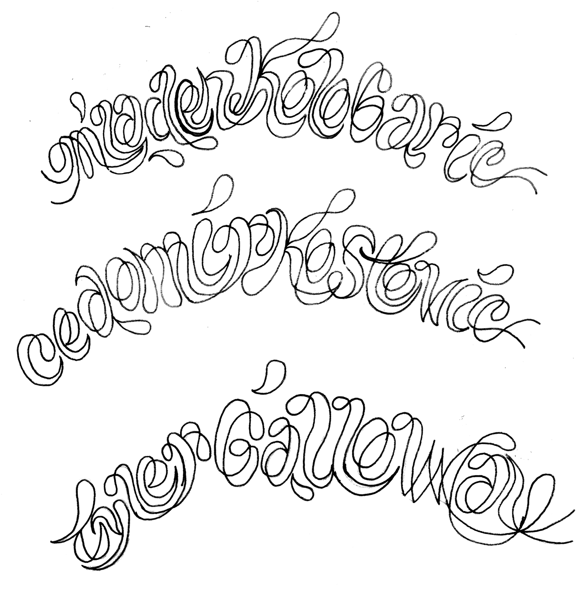
in the fall of 2013, my undergrad professor at missouri state university invited me to participate in an international poster exhibition he was organizing. titled "sarejevo 100", it is a collection of historical events from the past century of this storied city.
conversation maps, part 1
three years ago i had an idea in an elective i taught, called stories of the city, that i referred to as "conversation maps". the point was to use them as a way to record interactions with people in the community, organize the information, and be able to utilize it to gain new insights.
finally, i'm actually attempting to use it myself to map a couple of my initial interviews with k.c. bike activists. it's not all pretty just yet and it may not get any better. it was somewhat useful to go back through my notes and do this. i hope it will help me to sort through issues and ideas more easily as i move forward.
typeface in progress
i’m working on a stencil font based on the type i developed for the “spread love” poster. any thoughts? suggestions?


experimental typographic film
more work from the portfolio…
personal narrative combining experiments in filmed analog typography with digital manipulation. experimenting with two contrasting modes of storytelling — literal, linear prose and visually charged words / fragments.
hierarchy vs sequence
hierarchy - a system or organization in which people or groups are ranked one above the other according to status or authority. an arrangement or classification of things according to relative importance or inclusiveness. sequence - a particular order in which related events, movements, or things follow each other.i ask this question because i wonder if a headline is really more important than the specific content it aims to summarize, or if the contact information for a company is actually less important than the logo. i relate this back to larger things/metaphors such as the supposed equality of human beings (stated in the declaration of independence -- "...all men are created equal..." as opposed to the popular idea of the divine right of kings) where we should know that all people are indeed of equal importance, but are given different strengths, weaknesses, and purposes to fulfill in society/life. more simply stated -- not better or worse, just different. so i would suggest that each element in a designed artifact, whether it be type or image or what-have-you, is not necessarily better or worse or more or less important, but simply has a different role to play. but maybe this is not true. maybe some bits of information are less important. if so, why bother to include them? what do you think? post-script: an important follow-up question is whether this affects our form-making, and if so, how? does a new-found respect for the importance of detail information cause us to treat it more respectfully in a visual sense? does it visually flatten out our "hierarchy" or have no visual effect at all? i'm curious...

