
For my internship at The New Programme, I was assigned to create the logo for the Rozarks in Rosedale. The Rozarks are natural biking/hiking trails, and are described as an "urban nature escape." The new logo will be placed around the trails acting similar to a national forrest trail sign.
We met up with Brett to go over ideas he had in mind. He didn't want the logo to be too traditional looking. Brett wanted something fresh and which emphasized that these biking trails are an oasis in a city. We should include both nature and urban features within the logo. He also thought we could use the Rosedale Arch in some way as well.
mission statement
-connect people to their neighborhoods and nature
-provide a space that’s safe and accessible to neighbors to lead healthy lifestyles.
what kind of look and feel do you think it should have?
-get away from the national park standard: earth-tones, browns, greens.
-signs need to be highly visible. but not necessarily blaze orange.
-he likes the simplistic style.
audience
-kids and bike club by the school.
-neighborhood people of all sorts.
trail signs
-arrows are separate so you can turn various ways.
content
-trees
-maybe arch
-maybe bike, hiking, running
-“the rozarks”
-provide alternative transport links along the hillsides that aren’t currently available.
Brett gave us a list of his inspiration from other logos that are out there. So I first looked them all up to see the current trends and get inspired.
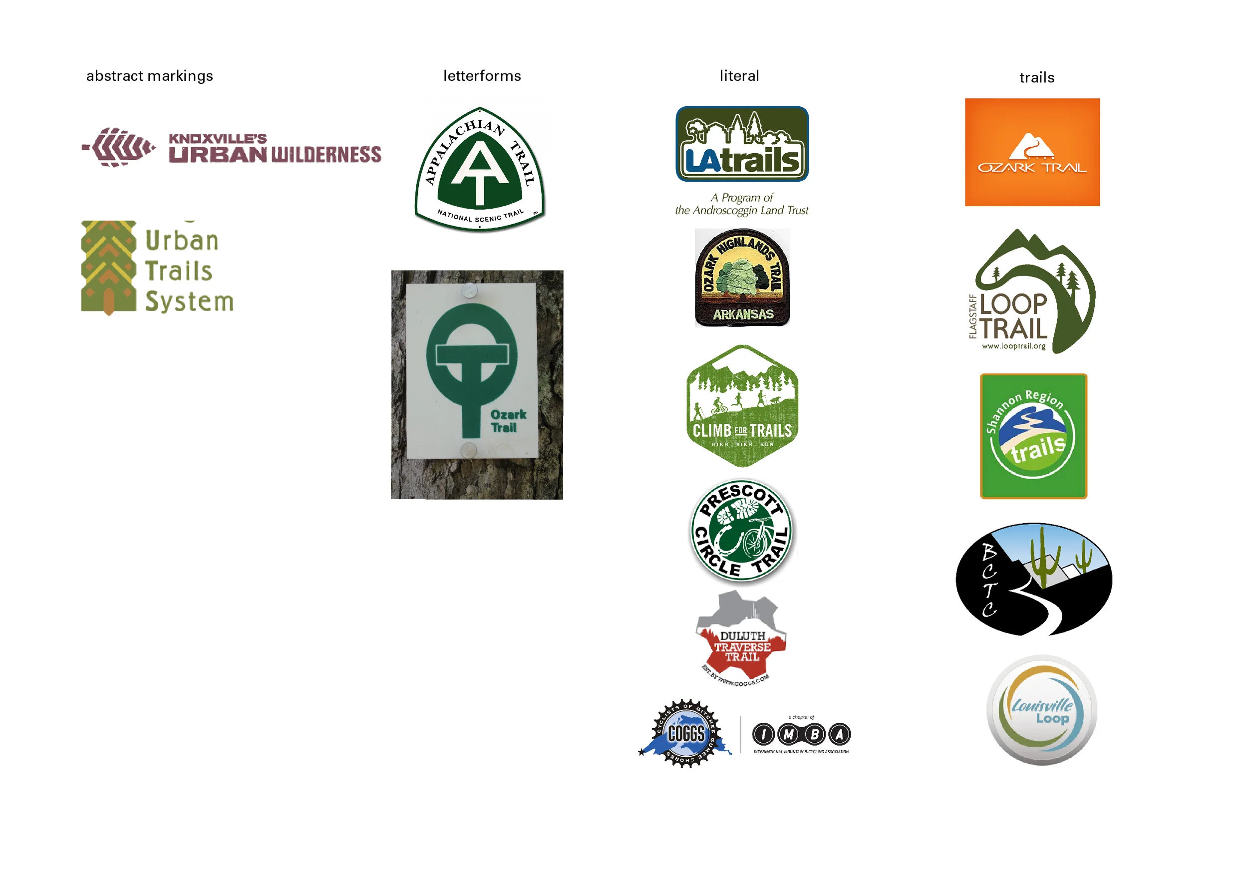
Research collected on existing bike trail logos
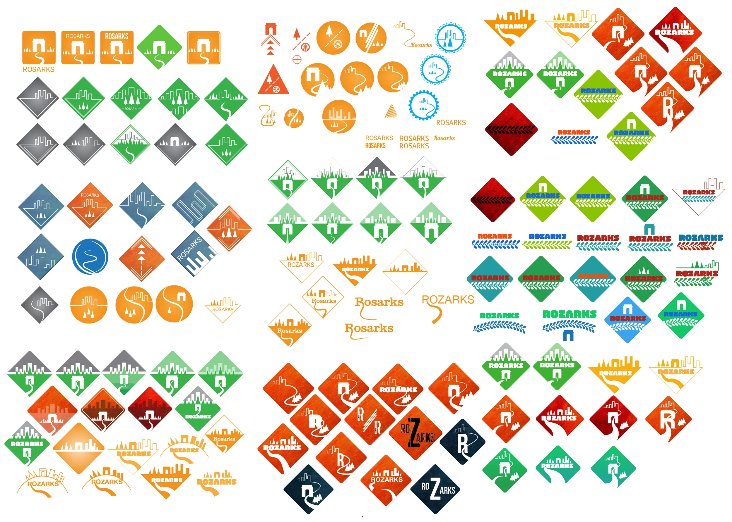
Here are all of the iterations I did over time to try to get ideas, colors, and typography down on the new logo. I definitely wanted to include the city, arch, and the trails to represent that these are urban trails. I liked going for a diamond like shape to represent a park sign.
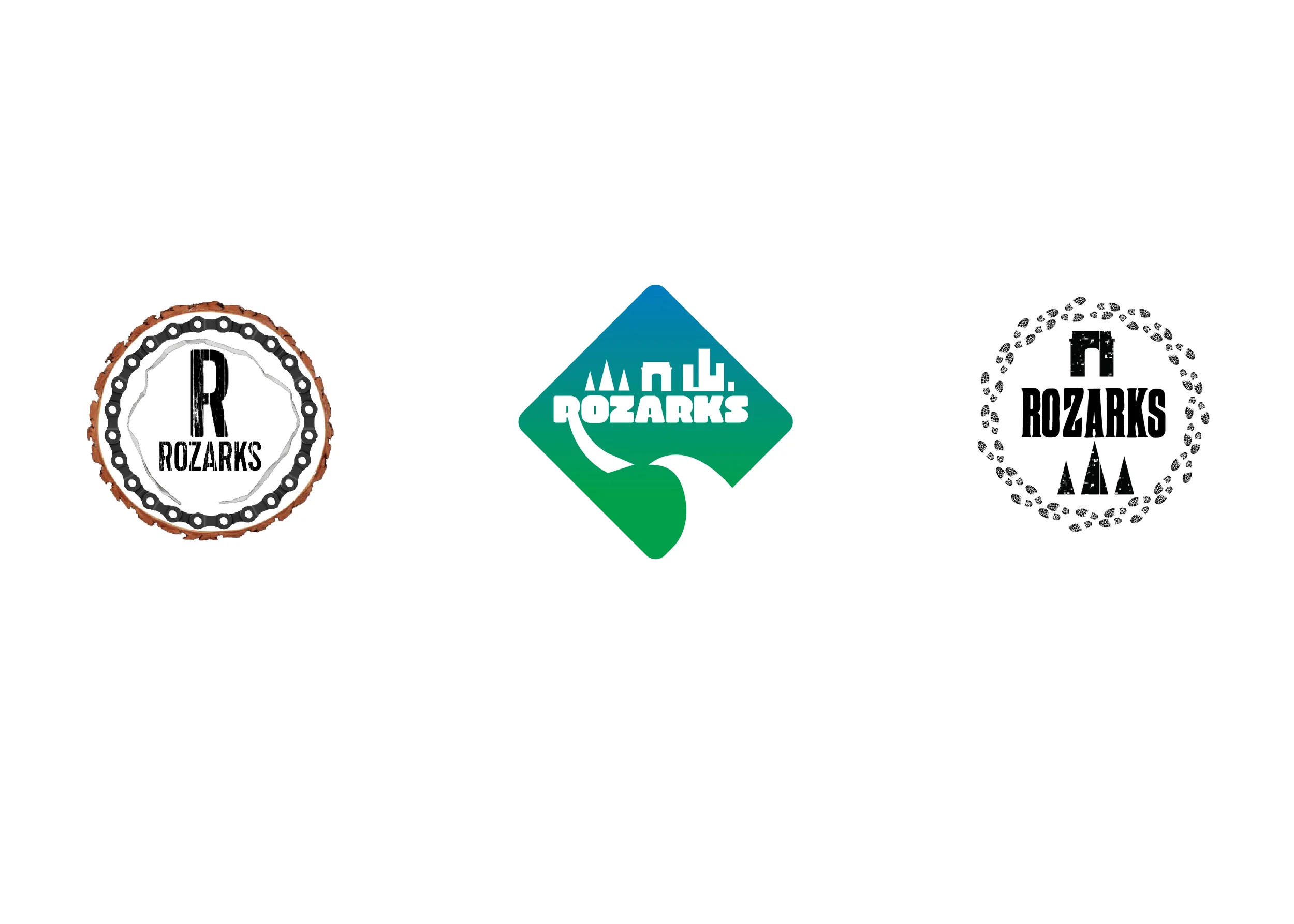
The final three ideas we sent off to Brett
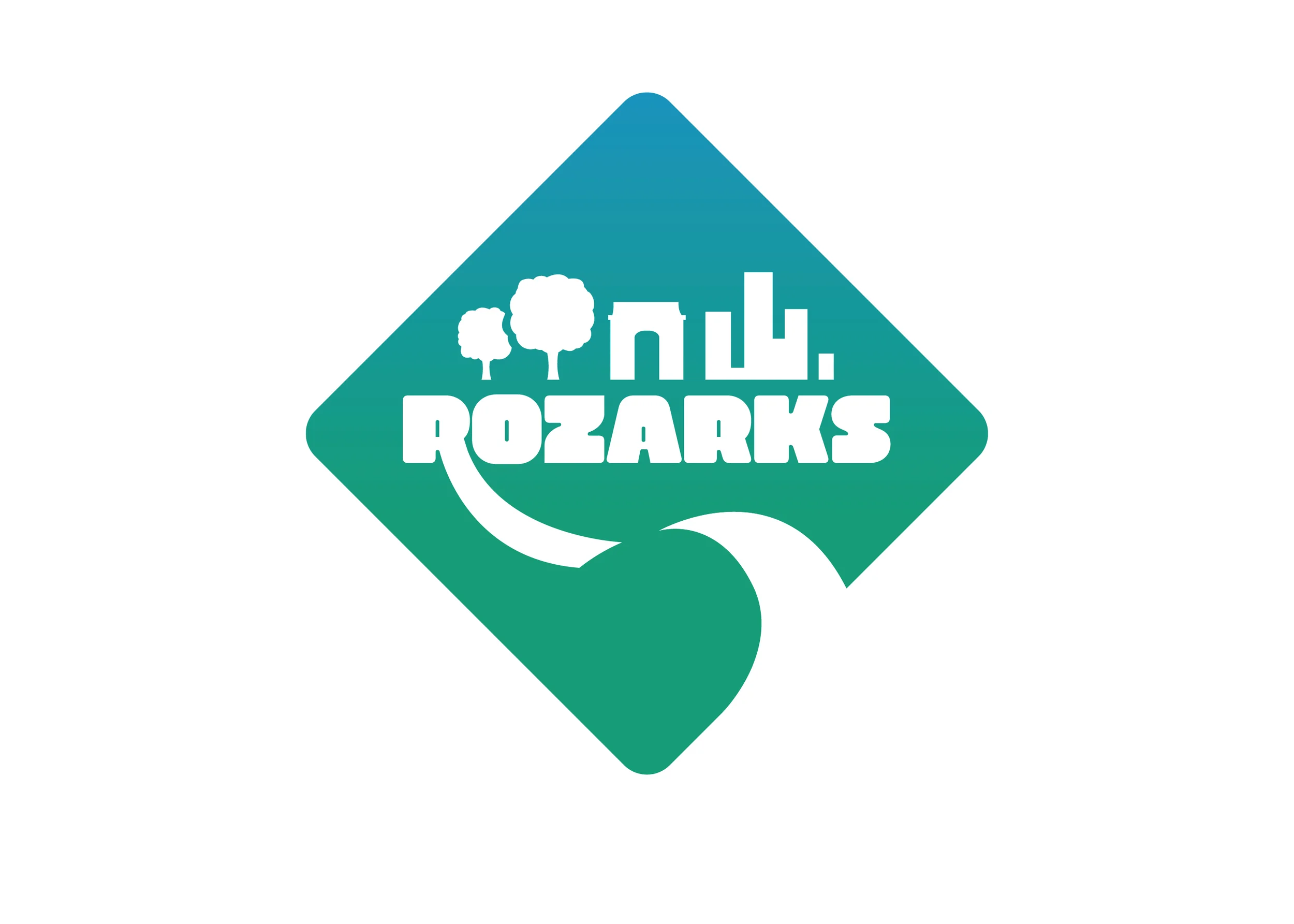
Final Logo